
Case Study
Nature Buddy
Boost mental health with intensional time outside.
Work is stressful. Nature helps.
Many people spend their days indoors working behind screens which contributes to poor mental health. Time in nature reduces stress but people struggle to constantly get outside.
Say hello to Nature Buddy
Your friendly reminder to get outside guided by engaging objectives to keep you present on your outings for a greater impact on your mental wellness.

My Role
Product Designer
Scope
Research, Strategy, Architecture, Wireframes, UI, Prototype, Testing
Timeline
10 weeks
Tools
Figma, Maze
“I really love the concept, the visuals, the illustrations, and the gamification of getting outside. I wish I could download this app right now!”
Mikayla · Financial Analyst
“I like the little character a lot, and I feel like everything is really intuitive and actually would help me get outside!”
Jonathan · Student Wellness Advisor
Impact: User Feedback
90% Indoors
Adults in the U.S. spend over 90% of their time indoors.
67% of Gen Z can do days without leaving their homes.
Sources: Utah State University, American Enterprise Institute
Based on 5 User Interviews
Everyone wants more time outside
Motivation is Key
When there was no obligation to go outside, participants would resign to staying indoors.
Work is Sitting Inside
All participants worked desk jobs and sited either work as a significant source of stress.
Access to Nature Matters
Proximity to nice outdoor spaces had a direct correlation to how often participants went outside.
Exercise Isn't The Issue
No one reported needing help exercising. Each participant worked out on a regular basis.
“Walking to the same places gets boring and I don’t like to walk aimlessly.”
Jenny · Washington DC
“I like going for short walks during my breaks at work. It makes me feel refreshed an energized.”
Jonathan · Santa Monica CA
“Three or four times a week I go on runs outdoors, and I walk my dog daily, but I still want to spend more time outside.”
Miriam · Rawlings NC
How Might We
help people with busy schedules spend consistent, intensional, and low-effort time outside in their community to alleviate stress?
Users fit into three archetypes
Who would benefit most?
Utility Walker
All it takes is a bit of motivation to get these users outside. Discovering a new coffee shop, or needing to take the dog out will get them out the door.
Mindful Escapist
Self aware of their mental health, these users prioritize activities that feed their soul. When reminded, they’ll take actions to decompress.
Athletic Enthusiast
The outdoors are viewed by some as Mother Nature’s fitness facility. While this group enjoys time outside, they are not the focus.
Competitor analysis showed a clear opportunity for
Mindful Exploration

Designing feature that will
Encourage Mindful Outdoor Time
Gamification
Use a task and rewards system to motivate users. Charming character design will make the experiences more enjoyable.
Objectives
Providing tasks for users to complete when outside will make their time outside engaging.
Reminders
A fun reminder system will help users spend consistent time outside to create sustainable mental wellness practices.
Reflection
Awareness of the impact that time outside has on mental wellness is key for stickiness.
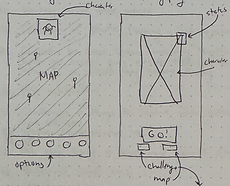
Exploring Info Architecture Through Sketches
Working through layout sketches helps map out future user flows and inform how to structure the tool.


Simplicity Is Key
With any friction, users will opt for easier ways to decompress.

The goal is less screen time, more outside time.
Each screen must be key
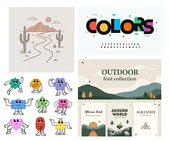
Developing Branding
Balancing Grounding Energy with Whimsical Aesthetic
A soft earth tone pallet grounds the background, while delightful characters bring energy. The hand drawn aesthetic connects both styles.
Mid-Fi Wireframes for Usability Testing
Highly Engage with Nature, Not the Interface
Moments when the interface is engaging are intensional. Users are not looking for a source of constant entertainment, but rather a mental wellness tool.


100% Task Completion... and User Confusion
While all users were able to complete the a challenge during testing, none of them used the intensional route, and all were slightly confused.

Revision: Progress and Action Indicators
Multiple users cited there was no time to process if or how the task was completed, so an additional confirmation step was added.
Refining High Fidelity Wireframes
Would Integrating UI Resolve or Unveil Issues
Clear hierarch was a reoccurring issue during lower fidelity testing. When making UI choices this was top of mind.


Achievements
A variety of tasks for users to complete outside to give direction and be mindful.

On Outing
Once you begin your outing this is the active use screen between tasks.

Logging Photos
Native camera feature allows users to document their observations easily.

Overview Stats
Upon completion, users can see their progress and Buddy’s status.
Second Usability Test Preparation
Task Flow For Testing:
Simple But Important
The next test was focused on the active use portion of the app as that is where the most impact will happen in the user journey.

Hi-Fi Figma Prototype
The interactive prototype was built and tested in Figma and Maze. While all buttons were clickable, there were limitations around the camera feature which posed a small challenge in testing.
Prototype Link:
https://bit.ly/naturebuddy-prototype

Strong test results suggest effective design
100% Success
Four of the five tasks that were tested had a 100% success rate.
84.8% Positive
During open ended questions, users responded very positively.
13.6% Misclick
Intuitive navigation was a key design focus to retain users.
Revisions based on usability test
Additional Steps
Smoothed the User Flow
Multiple users continued to struggle on this stage of the flow, so choosing one of the limited options was made mandatory to proceed.

Subtle Adjustments Improved Accessibility and Visual Design
The Reflect icon was not universally understood in mid-fi testing, so a preference test was included during high-fi testing to choose a new icon.

Learnings
Use Color Intensionally
While the colorful backgrounds and UI created a playful experience, certain screens became cluttered lacking a balance of white space.
Clear Visual Hierarchy
Reducing the options users could interact with and making desired buttons more noticeable reduced confusion.
Importance of Test Structure
The structure and wording of the questions in the usability test impacted the results and feedback from users. A better constructed test may have lead to different insights.