
My Role
Product Designer
Scope
Research, Strategy, Architecture, Wireframes, UI, Prototype, Testing
Timeline
8 weeks
Tools
Figma, Whimsical
Assignment
Event planners need support.
Design a tool to support event planners, making their jobs more efficient, less stressful, and that empowers individual to plan events that will positively impact their communities.
Problem
Is it even worth all the work?
Event planners spend so much time and effort doing administrative work like organizing and documenting they don't have bandwidth pour their full creative self into their events. High stress the planning brings keeps them from enjoying their event. Planners love bringing people together but the process creates a hurdle.
Solution
BashDash
An end-to-end designed mobile first web tool created to reduce stress and mental load for event planners so they can bring their visions to life.
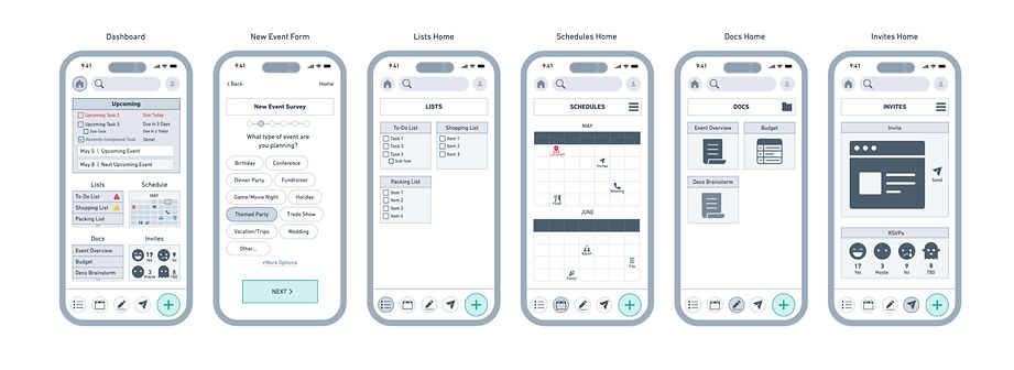
A sneak peak of the end result.
Simplifying event planning by easily managing event details in one place.
Step 1: Complete quick survey with event detsils


Step 2: A high level
dashboard is created

Step 3: Updated tasks lists and document important info as needed


Results
100% of users
could navigate the app and set up their dashboards quickly.
Who are our users?
Individuals passionate about bringing people together to create impactful moments.
Everyday people with personal investment in the event's success, not professionals planning out of duty.

Identifying user challenges
Is event planning actually difficult?
Yes. Very. Two interview participants cited they would have hired an event planner if they could afford it. Another mentioned he once fell asleep during his event because planning and executing his party physically and mentally exhausted him.
Defining user motivations
Why go through all the work?
User interviews highlighted that the Casual Planners–who are the target archetype, opposed to Professional Planners who make a living from event planning–are people oriented, generous individuals who are personally invested in creating community and shared experiences.
Exiting tools do too much or too little.
Competitors included project management tools and specialized planning tools. Asana and Planning Pod were the strongest options, but their complexities make them better suited for industry professionals. While the Knot and Partiful have narrow use cases.

Tools that do too much have steep learning curves.
Multiple users explained that lengthy onboarding and set up or overwhelming features was a deterrent from other tools.

Tools with singular use cases are insufficient.
Many single-function tools do their job well, but require users to juggle multiple tools in order to execute their events. Keeping track of multiple tools is overwhelming.

Events are highly complex so feature prioritization is key.
To distinguish from existing tools, and add genuine value to event planners, the tool needs to accomplish the highest priority tasks. Four elements were identified as crucial to all events, to do lists, documentation, RSVP tracking, and scheduling as well as a dashboard to quickly see a high level event status.

Tailored productivity tools present great business opportunities.
There are numerous overlaps between event planner goals and profitable business opportunities making this space particularly interesting. Three overlapping needs that were particularly high impact were consolidating tools planners needed, making the set up of this tool quick and easy, and reducing the stress that comes with event planning.

Mobile first design for users on the go.
While most users mentioned using spreadsheets which are designed for larger devices, most planning was done on mobile devices. Early sketches worked within the parameters following design systems found in project management apps.

Information architecture must be intuitive or the tool will fail.
The tool will only be successful if it’s easier to navigate than alternative tools and event planner’s existing tools. A card sort activity validated the four primary categories identified aligned with the mental models of participants. Significant time was spent developing the site map to ensure it would be easy to navigate.


Is this faster and easier than alternatives?
To validate that the onboarding process was quick and required little mental load thorough user flows and task flows were worked through. Mapping out these decision points provided a visual showing if the tool set up was simple or cumbersome.

What do competitors do well and how can we improve?
Detailed digital wireframes made it possible to evaluate the effectiveness of the layout. Design decisions including the single-select survey questions inspired by Google Forms, and RSVP icons inspired by Partiful, continued to be effective. The calendar for example cluttered the dashboard and was difficult to interpret at the scale from the lo-fi sketch.

Aesthetics are a powerful stress reducing tool.
A color palette was built to evoke a grounding feeling and a welcoming environment using warmer tones. The complementary blues bring a tone of energy and professionalism.

UI elements are simple and easily recognizable to mental load, using high contrast colors, and soft edges to exemplify ease, as well as subtle hints of playfulness. The logo was created out of simplicity and structure represents organization, a space free of clutter, and professionalism. The used overlapping shapes symbolizes people coming together over a shared experience.


Testing to inform optimizations.
Observing five individuals complete a series of tasks in the Figma prototype highlighted four key takeaways.
1. Onboarding survey was easy to complete and intuitive.
2. “New” button on dashboard was used by 1 participant.
3. Bottom navigation buttons were used by 3 of 5 users.
4. “Recent Files” section was only understood by 1 user.
Overwhelmingly positive feedback
indicated an effective design.
All participants completed each task with little to no errors. The recent files placeholder content however did confuse some participants and the lower menu bar was not utilized which informed the two most significant revisions.
