
BashDash
Plan your next event with ease.
An end-to-end designed mobile first web tool created to help event planners bring their visions to life.
The Brief
Design a tool to support event planners, making their jobs more efficient, less stressful, and that empowers individuals to plan events that will positively impact their communities.
The Problem

Event planning is complex, time-consuming, and highly dependent on organization. This project looks to streamline that process for people planning meaningful events without professional tools.
How can we keep event planners more organized and efficient while also spending less time trying to set up project management tools and documents? By freeing up valuable time and mental capacity, planner can focus more on refining their event and lowering stress. For this project, I served as the sole end-to-end UX/UI Designer and completed the work within a two-month timeline.
Competitors
Competitors primarily included project management tools and specialized event planning tools. While Asana and Planning Pod are strong options that can be very effective for event planning, they have a steep learning curve and are better suited for industry use where professionals have bandwidth to maximize these feature rich tools.
There was an opportunity for a tool that was more tailored to event planners than a simple word document app, more intuitive and user friendly than a project management tool, and offer enough features that the entire event could be organized in a single place.

User Interviews
Primary research consisted of six virtual interviews I conducted with a range of event planners. Half of the participants planned events at the corporate and organizational level, two planned their own weddings, the others planned smaller scale events.
From the interviews I observed several universal traits: event planners are generous, people oriented, they are motivated by creating community and shared experience, seeing visions come to life, and prioritize attendee experience.

Two Archetypes Emerged
Professional Planners who organize multiple events a year, are highly organized, and use multiple tools.
Casual Planners who often organize one-off events, value community, and prioritize attendees’ experience. This persona was the target audience.

User Scenarios
Three desires of casual event planners were identified, documenting and tracking projects more easily, minimizing the number of tools needs, and setting up their tools quicker.
Tedious Onboarding

Information Overload

Project Goals
The user interviews were by far my biggest source of information and guiding force. I created an affinity map and deduced a set of user and business goals to identify the overlapping areas to focus on.

Features
Keeping the users front of mind, it was apparent what features were essential and where to focus my energy. The four areas of focus were lists, documents, rsvp, and schedules.

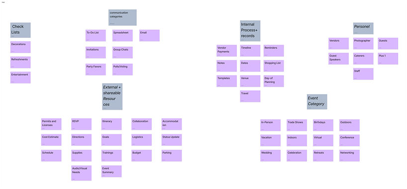
Card Sort
The card sorting activity validated the four primary categories of shopping and tasks lists, schedules, documents, and RSVPs where most event planning topics fall under. The biggest difference between participants was their labeling for each category. One outlier also highlighted the different mental models that exist between planners.
Sitemap
Significant time was spent developing the site map to ensure the tool would be as easy to navigate and intuitive as possible for users. During early versions, some repetitive features were identified and consolidated. This is the final sitemap that was used for the remainder of the project.

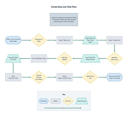
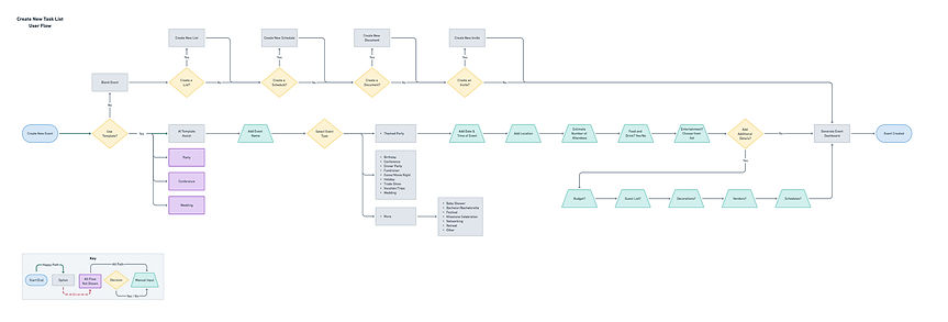
User & Task Flows
Simplifying the onboarding process was a key need from users. The user flows were key to work through the new user process and informed the decision to make multiple survey questions optional to speed up that process.
Lo-fi Sketches
Early sketches featured modular layouts inline with design systems of other project management tools. With content heavy tools, blocking content in this way keeps users from being overstimulated.

Digital Wireframes
Adding more detail in the digital wireframes help refine how the content would be displayed. Toolbar and navigation layouts were refined and a cohesive layout for each different section was created.

Branding &
UI Library
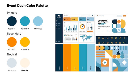
This color palette was chosen to evoke a grounding feeling and a welcoming environment using warmer tones. The complementary blues bring a tone of energy and professionalism.
The BashDash logo was created out of simplicity and structure represents organization, a space free of clutter, and professionalism. The used overlapping shapes symbolizes people coming together over a shared experience or interest–the heart of any event.


High Fidelity Wireframes
Branding and UI elements were applied to create the high fidelity wireframes. Introducing color in a manner that brought the design to life but was not overwhelming was important to preserve the user experience.

Usability Test
Five users participated in a usability test composed of three tasks: creating an event, updating a document, and creating a new task list. All users accomplished each task with minimal errors and utilizing several different paths to do so.
Key Takeaways
1. Onboarding survey was easy to complete and intuitive.
2. “New” button on dashboard was used by 1 participant.
3. Bottom navigation buttons were used by 3 of 5 users.
4. “Recent Files” section was only understood by 1 user.

Revisions
Based on test participant feedback, I made two large revisions. First was updating the recent files card to begin blank and only populate thumbnails after a user interacts with one of their files. The other main revision was changing the colors of the buttons in the menu bar so they are more noticeable.

Reflections
Developing DashBash highlighted the complexities that exist with in the project management style tool. Event planners have a wide range of needs and balancing versatility and user specific features is challenging.
Feature prioritization was vital to designing a tool tailored to my target audience. While they have a variety of needs, they all want a solution that is above all else simple.
Throughout the design process, I continued to simplify and refine the features and visual design. User testing was vital and highlighted behaviors I could not have anticipated.
Seeing layouts in high fidelity was important from a UI perspective. Designs that looked effective in sketches need modification when placed in context.
An area in the end-to-end design process I underestimated was script development for user interviews and tests. Longer scripts providing participants with more context increased success rates dramatically and provided more meaningful insights.
I’m excited to present DashBash and am confident it will help countless planners bring their events to life!